iFixit

Creating consumer clarity in eCommerce product pages

The Need
Improve add to cart rates and overall sales for iFixit’s e-commerce product pages which includes over 5,000 various products by creating unified responsive layout.
My Role
UI/UX Design, UX Research, Art Direction, Product Photography, Business Design, and Brand Strategy
Project Results
After a few weeks of A/B testing, we saw an overall 15% increase in add-to-cart rates and an overall 8% increase in order rates.
ifixit.com product page

The Main Problem

Consumers were unsure if they were purchasing the right part or tool.

This uncertainty led to a lot of questions and returns to our customer service department and limited potential sales. It also diminished the overall experience since a lot of users came from our well-organized repair guides to the cluttered product pages.
Contributing Factors
There was no defined system in place for introducing new product pages, no assigned person to manage the current pages (several people had access), and a wiki system in which anyone (even users) could make edits. This introduced lots of random and redundant information, incomplete product information, and a lack of specifications.

Getting Started

Going into this project, I already had some base knowledge of several problems with the pages. At the time, I had been working with iFixit for a couple of years and interacted with the product pages numerous times.

My first objective was to clearly define the different types of pages and the content each page included. Since we had over 5,000 products, categorizing the products was a priority because it allowed me to focus on the issues each type of product introduced to the current system and how it was being handled at the time.

I defined the page types into 5 categories: tools, toolkits, parts, fix kits (which included tools and parts), and gear.
Breakdown chart of page elements per category

Understanding our users

Hobbyists

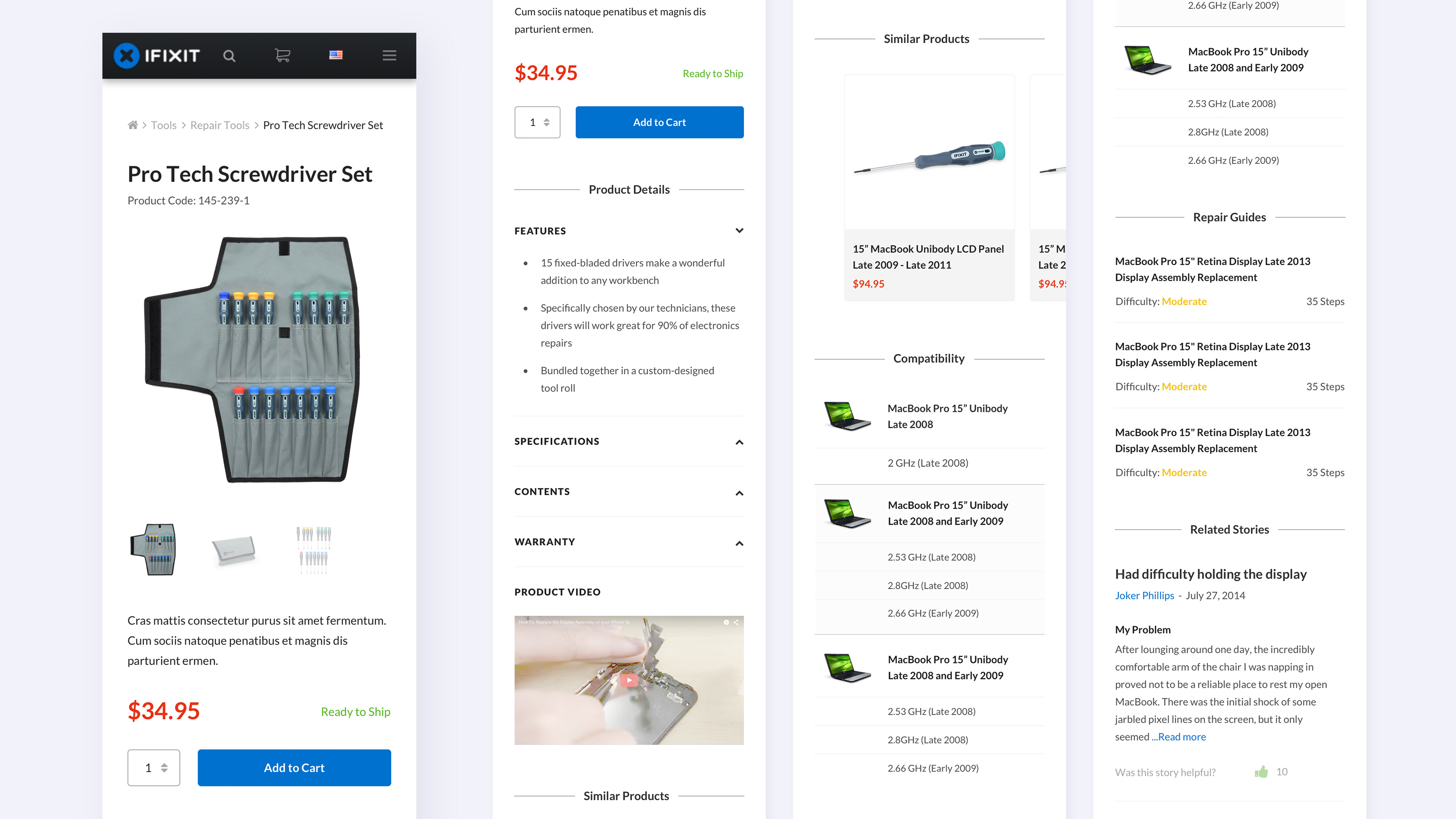
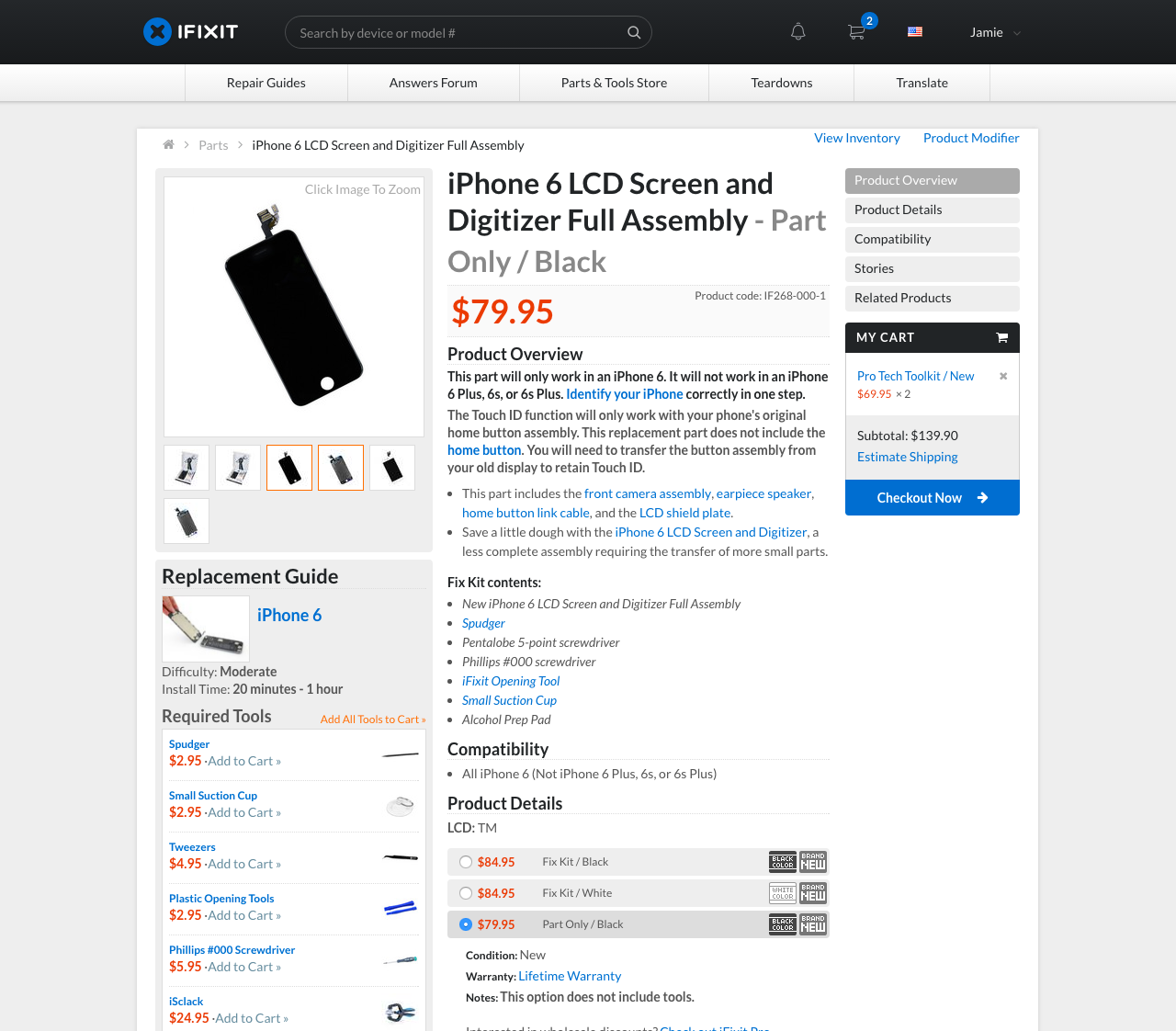
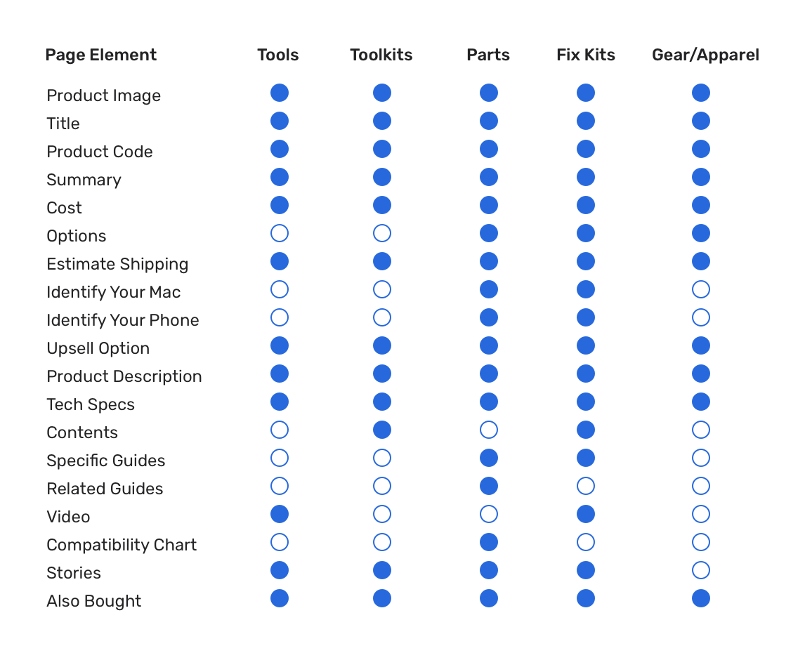
Hobbyists were considered to be the core of the iFixit community and the most frequent purchasers of products in the store. They spent a lot of time on our guides and were familiar with the quality of iFixit tools and parts.

Repair Pros

Repair Pros were considered to be anyone who would buy tools or parts in bulk or at wholesale for their respective business. Some repair pros were part of the iFixit Pro program which gave special discounts to wholesale purchases.

Need-Based Consumers

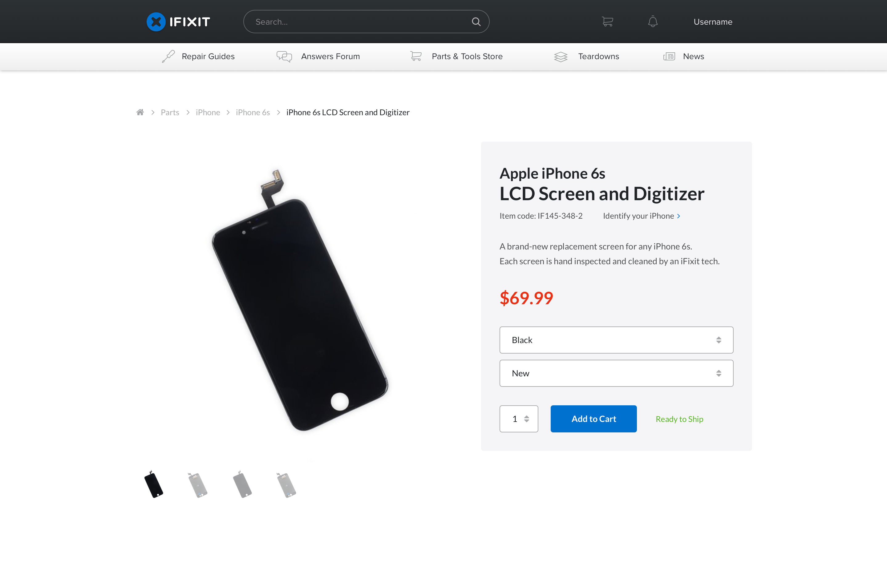
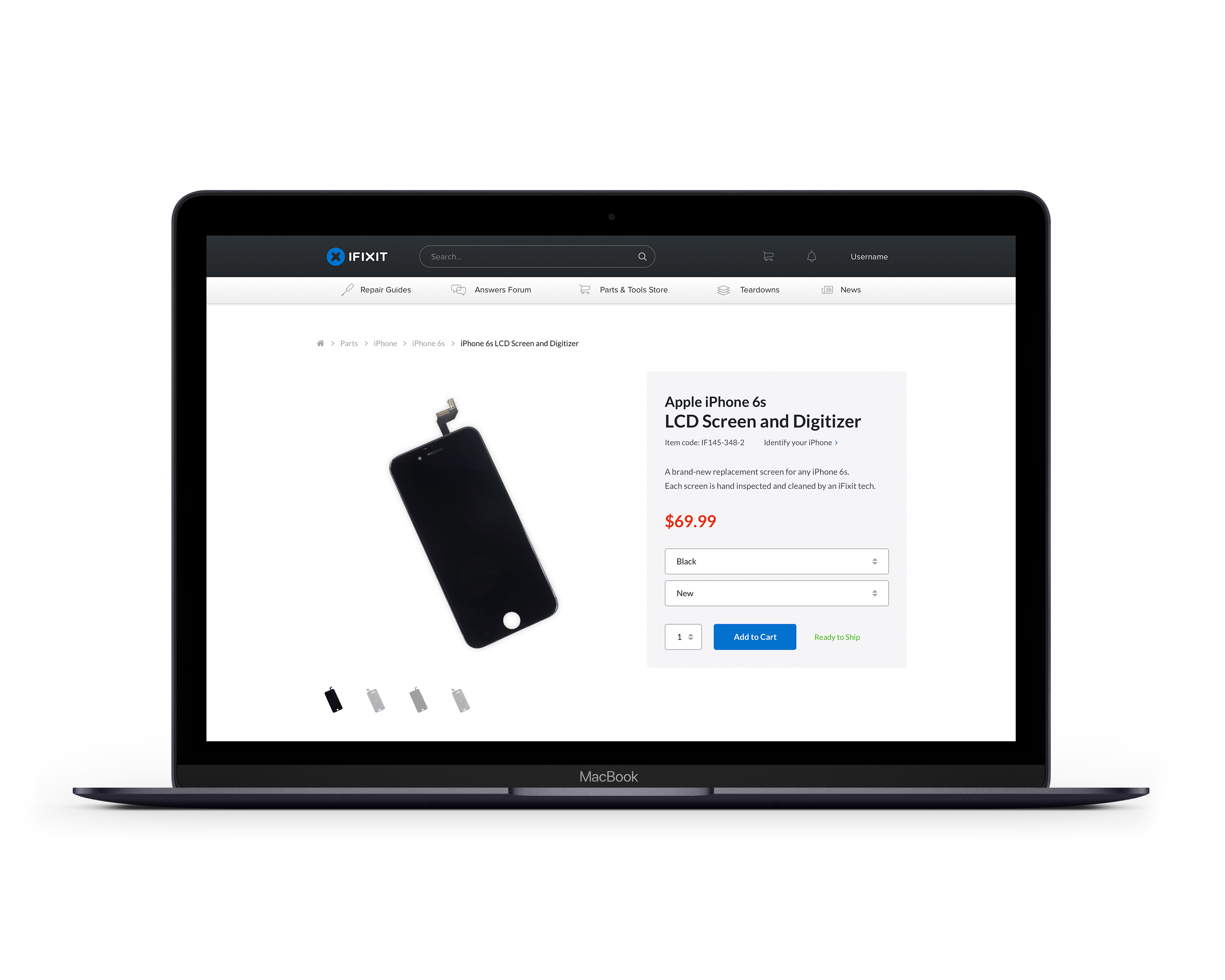
Need-based consumers were one-time purchasers who came to the product pages in search of a particular part or tool for a specific repair. These users needed information about the product to be clear so they could purchase with confidence.

Understanding the problem…more

Collect all known issues
The next step in the process was to collect and identify all known issues with the current product pages. Those issues came from customer service, conversations with our community forum, and internal site audits.

We split the issues into two types: organic issues which were found through testing without any predetermined parameters and defined issues which were issues that were intentionally looking for such as toolkit contents, product descriptions, and redundant information.
Collect consumer data
Next we ran a query to figure out the most popular products sold in the last 2 years. We then broke those into the defined product categories which gave us parameters for user experience testing. We used heatmaps and user sessions to identity key issues and opportunities for improvement.

Defining the key issues

There was no order of importance. The product pages were visually cluttered with lots of information that was emphasized inconsistently (bold, italics, font size) and often redundant.
Product names were too long and often hard to read which often caused users to buy the wrong part.
Too many links that took the user away from the product page and diverted the attention away from making a purchase.
Product overview section was often inconsistent with what information was given. The add to cart button got pushed down the page considerably for products with content lists.
Different product types existed on the same page. For instance, the battery pages also included the battery fix kits. In most cases, this wouldn’t be an issue. However, the overview information did not change when a different option was selected often causing confusion with what was being purchased.
Fix kit contents did not match the guide’s required contents.

Creating the solutions

My goal with the design was to create a clear, informative product view that allowed users to make a quick and easy purchase decision with confidence that they were getting the correct product they needed.
I reduced the amount of information displayed initially focusing on only the most important aspects. The clear product title was really important especially for parts.
Larger images made for a better visual hierarchy and allowed users to see more detail and identify parts more easily.
I then determined what information was needed for each product type and significantly reduced the amount of links.

Need help with a project?

I’m always looking for opportunities to collaborate.
Let's talk