Enhancing the appointment scheduling experience for users
I started this project as an opportunity to rethink the scheduling process and update the current interface as part of the new design system we were building. The project was previously paused due to other priorities but had gone through an initial discovery phase to identify user needs. I was the lead UX designer for this redesign but worked with the previous researcher and designer. I also worked closely with the product owner, business analyst, and several developers to identify needs and problems throughout the process.
View scheduling flow prototypeLead UX Design, UX Research, Art Direction
Working with the previous researcher and designer, we identified that users wanted the ability to view and compare the location and times of nearby patient service centers in order to conveniently schedule an appointment.
Quest needed more users to pre-register online to reduce wait time and lines at patient service centers. They also wanted more users to create an account during the scheduling process since you need an account in order to view your test results.
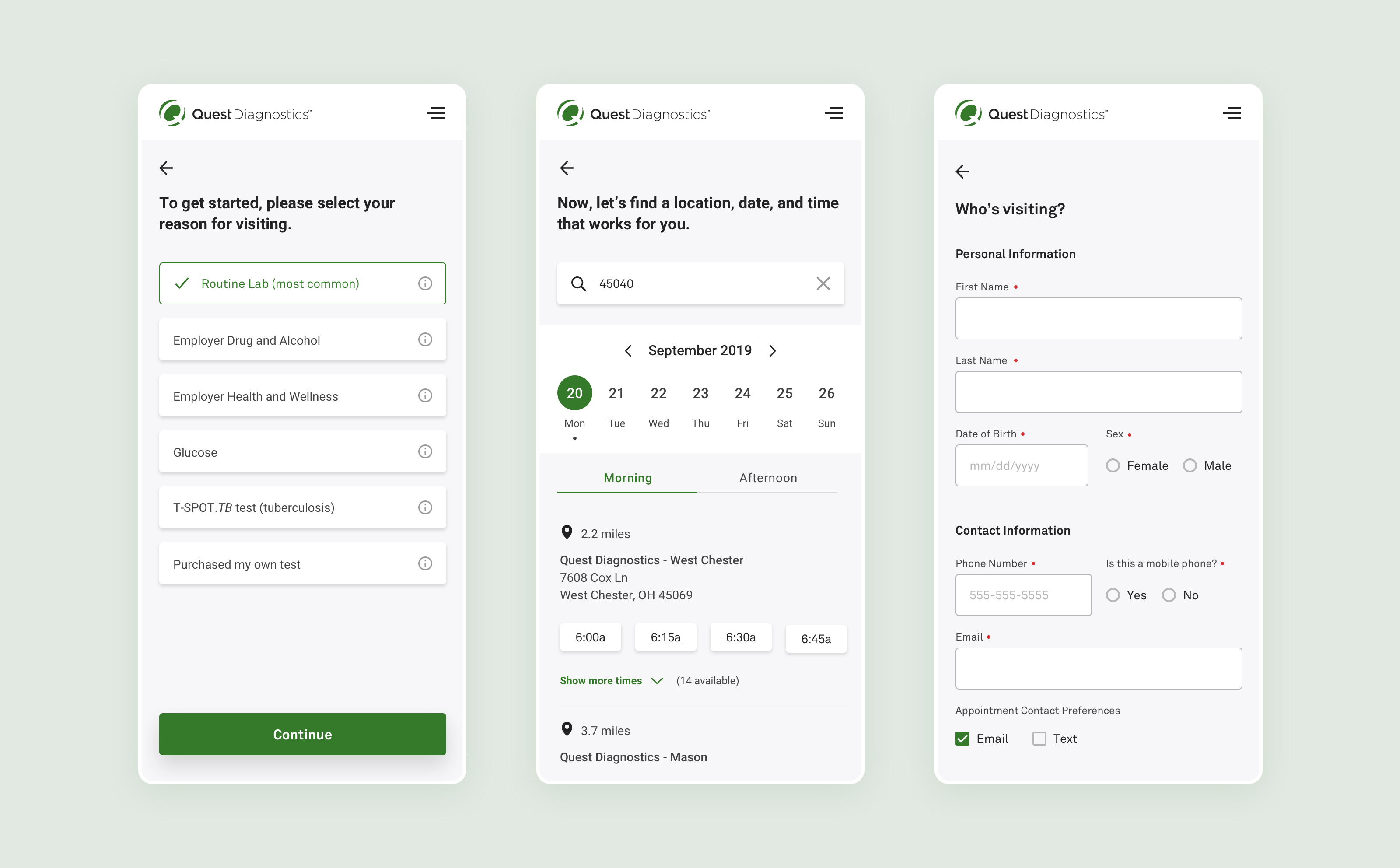
The first step I wanted to take was to get a better understanding of the appointment scheduling flow by scheduling an appointment for myself. I documented potential problems related to both the user and business needs as well as issues related to the user interface.
Users did not complete pre-registration because that flow came after the user had already scheduled an appointment.
Users also did not create an account because that flow also came after they had scheduled an appointment. (Later discovered that users did not understand why they needed to create an account).
Appointment cards were cluttered with information and little to no hierarchy which made it harder for users to quickly scan through the information.
The next step was to validate these assumptions with users. We scheduled several conversations with users to get a better sense of any pain points around the main topics.
Users felt that after they had scheduled their appointment, the process was complete which validated the assumptions for both pre-registration and account creation.
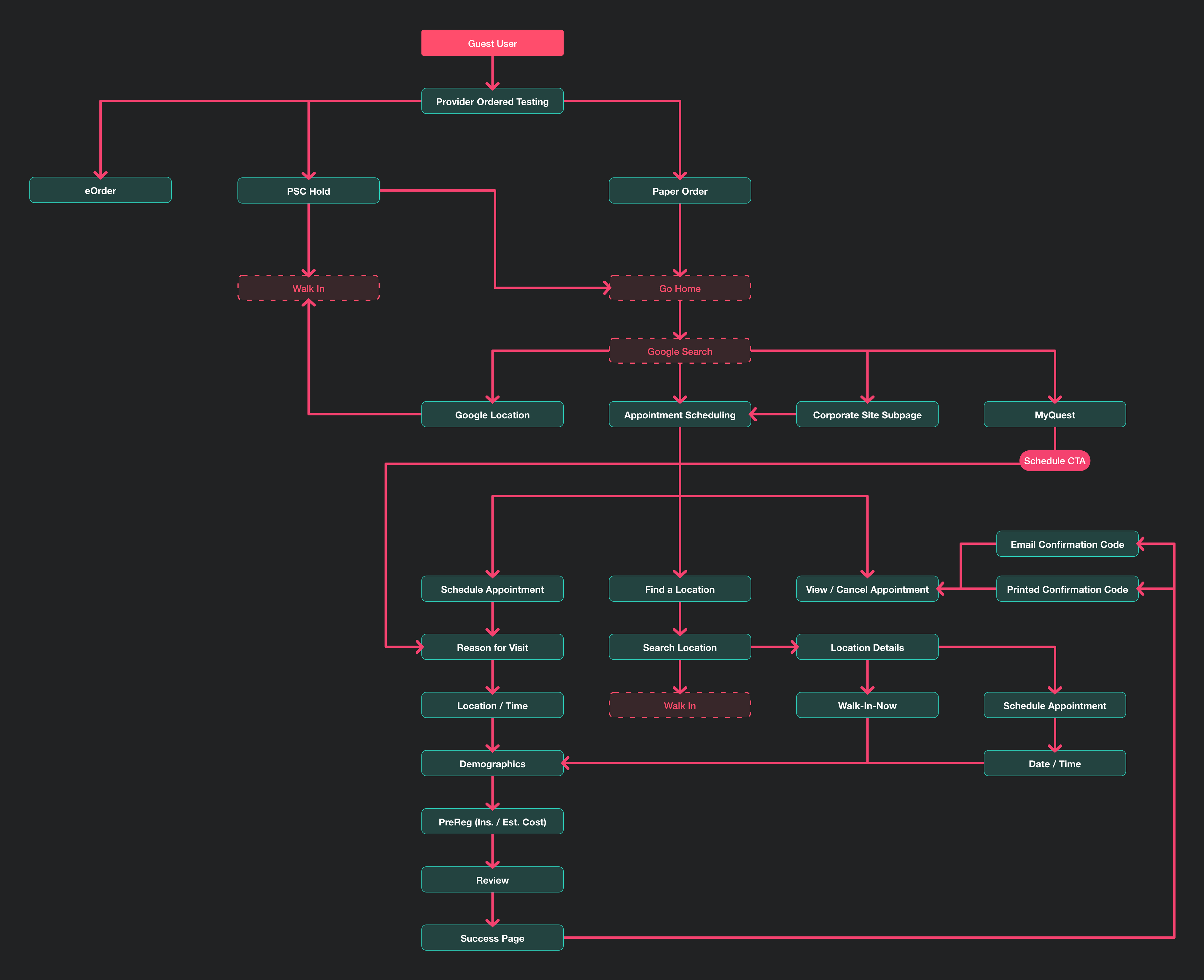
There were really two types of users: schedulers and walk-ins.
Schedulers: Users who were busy and preferred to schedule appointments when it was most convenient for their schedules. They also preferred to take care of any additional tasks prior to their appointment to save time.
Walk-ins: Users who just wanted the location of the nearest location and then show up at the service center when it was convenient for them.
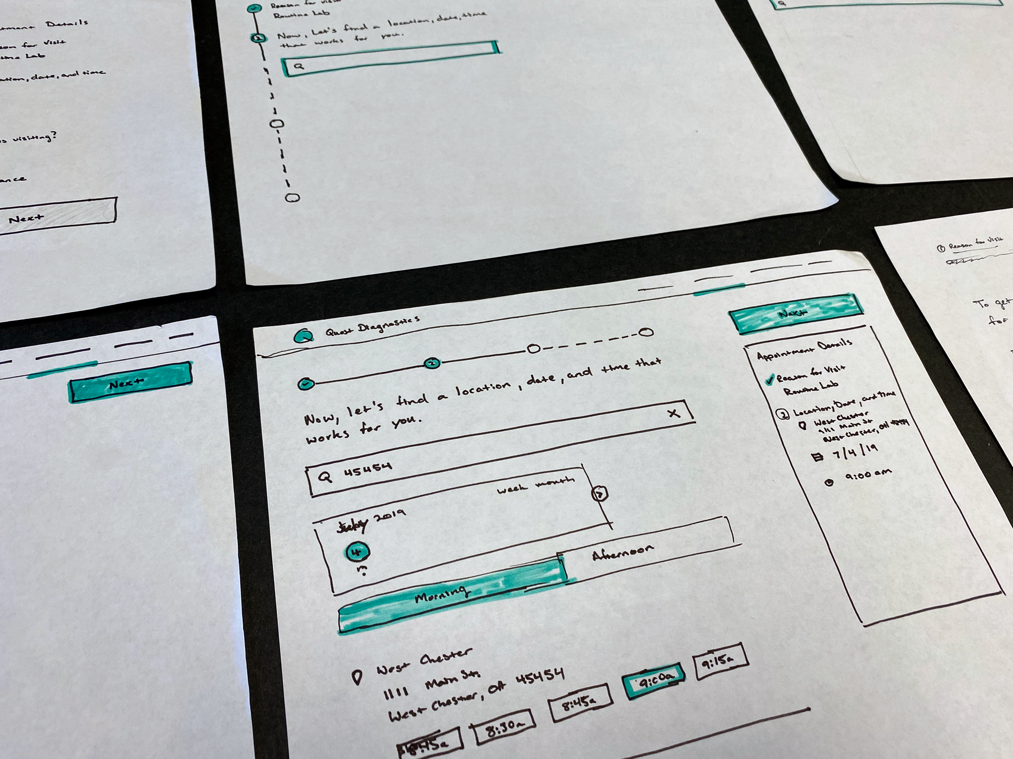
Data showed that most users scheduled their appointments within the first 7-10 business days from their doctor’s visit. With that information, we decided to show a weekly date picker that allowed users to quickly select the days they want to view.
This approach also reduced visual space and additional clicks. Users would still be able to scroll through to other weeks and/or change months as needed.
Next, we found out that not all service centers operate on the same schedule with some locations being open 24 hours. With the time slots being in increments of 15 minutes, we needed to break up the time slots into more manageable, and more importantly, scannable groups.
Our solution was to break the time slots into two groups, morning (AM) and evening (PM) which allowed us to avoid showing lunch hours and give our users a more focused view of the available time slots.
User feedback from prototype testing and conversations found our solutions easy to use. They appreciated the ability to see both times and locations at the same as well as being able to quickly adjust as needed.
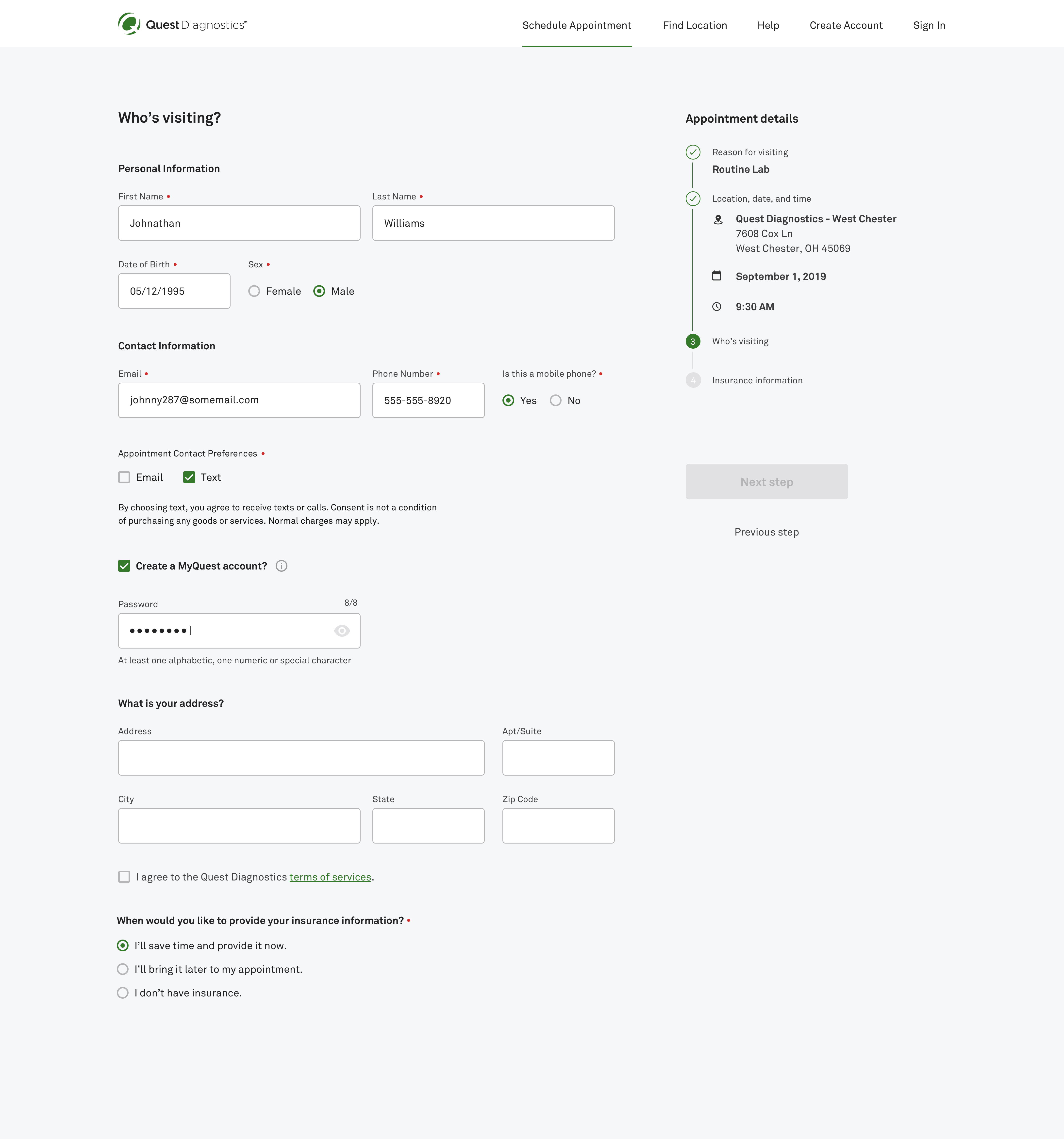
I moved pre-registration into the main flow prior to the user completing the appointment flow. Since users already have to enter demographic information, I assumed adding a few additional fields in an additional step would increase preregistration since users were already in the mindset of entering personal information. (We still allowed users to skip this step in case they did not have insurance or did not have their insurance information with them at the time.)
In addition, I moved the account creation into the demographics page since the information needed to create an account was already being entered here as well.
We also assumed that users might feel like this was a long process if included the pre-registration in the main flow. I decided to include a stepper in the interface to help guide the user through the complete flow.

We created a series of prototype testing and held conversations with users to understand if adding a step in the process would deter them from completing the scheduling process online. A majority of users did not mind the additional step and thought that it would allow them to save time by entering the information now while scheduling their appointment.
Users also appreciated the stepper component stating that it helped them know how many steps were in the process before completing. They also appreciated being able to double check the information as they continued through the flow.
After the initial development handoff, I continued to make iterations based on discoveries in the development process such as edge cases with insurance and service center limitations.